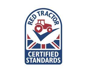
UK farm assurance scheme Red Tractor has launched a new logo that aims to set out the credentials of the food that carries it.
According to the organisation, the new visual identity addresses a number of the challenges that the British food and farming industry face and clearly differentiates to consumers the food which has been carefully produced to world-leading standards.
The design, which retains the union flag to reflect home-grown food, is said to reflect the work that Red Tractor has been undertaking to help improve its status and emotional engagement with consumers.
The key changes to the logo include replacing Assured Food Standards with 'Red Tractor'; an updated tractor to modernise its appearance and to bring it in to line with the TV advert's look and feel; the red tractor sitting on a ‘tick’ – recognised by shoppers as indicating that the product has been checked; the words ‘Certified Standards’ to clarify what Red Tractor does; and the addition of a heart in the wheel, to demonstrate the care and attention that is taken to produce the food.
The launch comes as new research has found that Red Tractor has a much higher level of awareness than all other food assurance marques. Eight out of ten shoppers are aware of the logo and see it as 'a positive, reassuring on-pack signpost in supermarkets.'
The rollout of the new logo is expected to take around 18 months as brands update their packaging. It will be supported by a new 12-month, £2 million ‘Tractor Test’ campaign, designed to increase shopper understanding of Red Tractor by getting the nation to think about the food they buy, where it comes from and how it’s been produced.
Consumers uncertain of Red Tractor meaning
Red Tractor chief executive Jim Moseley said: 'While it’s great news that almost 80 per cent of British shoppers recognise Red Tractor and see it positively, our research also found that people were uncertain of what sits behind the logo or its benefits.
'Given the great care and attention that Red Tractor and our farmers put into ensuring that the food we eat is safe and fully traceable, we owe it to our members to improve shoppers' and diners' understanding of the scheme.
'Created 20 years ago to rebuild trust in British agriculture after a spate of food scares, the logo was designed to be very utilitarian. Two decades on, we are facing a new watershed moment, with the market facing huge uncertainty with the ongoing trade negotiations.
'At this time it is critical that we help shoppers to clearly differentiate which food has been produced and checked to world-leading standards from farm to pack – and the simplest way to do this is to look for the Red Tractor and the tick.'
With over 46,000 British farmer members, approximately 75 per cent of UK agricultural output is Red Tractor assured. 'The new look for Red Tractor is one of a number of new initiatives we have been working on to improve shopper understanding, increase choice and to strengthen the robustness of the scheme,' Moseley added.
Using seasonal produce and other core categories the campaign will illustrate the journey Red Tractor food has taken, the quality of the standards and robustness of the scheme – from farm to pack.
The campaign will kick off with the Red Tractor TV ad running on primetime TV, digital channels and on-demand over Easter.


