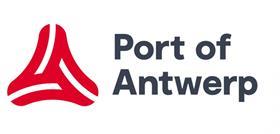
The Port of Antwerp in Belgium has introduced a new visual identity to better represent its identity.
The aim is to further raise the port’s profile as a world-class port whose success has been built on collaborating, building bridges and bringing different worlds together.
“A major international port deserves a strong identity,” the port authority stated, “an identity that gives a powerful signal to the outside world.”
Describing the brand as “innovative and open to the future, but also proud of its successful past”, the port authority aims to build on such successes with its new logo.
The sharp edges of the original logo have been replaced by curved edges, which are meant to symbolise accessibility.
“We bring customers, society and the world together, creating a dynamic between them,” the port authority explained. “The bright red colour radiates force and vitality.”