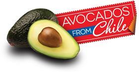
The Chilean Avocado Importers Association (CAIA) in the US has launched a fresh new logo in its latest move to distinguish the organisation’s product for retailers and consumers.
“The strategy behind this updated version of the logo was to elevate the country of origin by highlighting the personality of Chile and the seasonality of the product,” said Maggie Bezart, CAIA director of marketing, in a press release.
“We wanted to promote this elegant upscale product by incorporating the vibrant red, white and blue colors of the Chilean flag and details such as the ribbon and cursive typeface,” she said.
In addition to more of a Chilean flair, the organisation said the new logo was also inspired by the design of a label or seal of freshness.
“The look of the stamp is a concept that is meant to convey the freshness of the avocados. The message is that the product has just been delivered and the seal has been placed on it,” explained Bezart.
Versions of the logo include a corporate design as well as one specifically for product advertising.
To coincide with the launch of the updated logo, a new website has been created.
The new logo marks the first time in ten years that CAIA has changed its image and the organisation plans to incorporate the new look over the coming year, along with a new season-long integrated marketing campaign.
Established in 2002, CAIA comprises a number of Chilean avocado importers, exporters and producers.
The association’s main objective is to conduct market development activities and promotions to increase the consumption of Chilean Hass avocados in the US during the Chilean season, October through March.


